Continuously monitor your performance with a KPI dashboard
An interactive management dashboard with KPIs is an effective tool to closely monitor the performance of your organization and teams. You can create a dashboard without too many bells and whistles. Dashboarding can be learned playfully, but interpreting the data on a dashboard is not easy. It requires the necessary analytical skills. Passionned Group has been supporting decision-makers for years in creating, improving, and working with KPI dashboards. In this article, we will answer the following questions: what is a dashboard? What types of management dashboards actually exist? And how do you create an effective dashboard? What are dynamic dashboards?
What is a dashboard?
A well-designed management dashboard is a strategy performance management tool that quickly lets you see if your company is still on track. It also shows you at a glance if there are any problems in your company processes, and if so, where. You can see whether it’s a new or old problem and which actions have been taken by which employees to solve it. The best-known definition of a dashboard is the one from Stephen Few, a data visualization expert. He defines a dashboard simply as:
A visual representation of the most important information necessary for the realization of one or more objectives.
You consolidate that information and arrange it neatly on one screen so that the user can monitor the results at a glance and see where things are going right or wrong, or where there could be a risk of going wrong.
All dashboard data must fit on one screen
 There is a precondition that all dashboard data must fit on one screen. In other words, scrolling on a dashboard is actually out of the question, especially on a desktop computer or tablet. If you are going to “dashboard”, you will therefore mainly have to fiddle with the usually limited space. Publishing a complete list of customers is not a good idea, you do that in a report. A top 5 of the most important customers, suppliers, or products, however, will give your dashboard users the desired quick insight.
What is a data dashboard?
What is a data dashboard? A sharp definition of a data dashboard does not really exist. In practice, a data dashboard is usually identified with a visual, intuitive tool. That tool then offers interactive functionality for monitoring, analyzing, and extracting relevant valuable insights from various data collections.
What is a KPI dashboard?
When you start visualizing key business objectives using one or more dashboard tools, an analytics KPI dashboard is created. These so-called key performance indicators (KPIs) act like a magnifying glass. Again, the tendency is to include many KPIs in the dashboard. But remember to only use relevant KPIs, if there are too many the goal won’t be reached. Do you need help finding the right KPIs for your dashboard? We would be happy to help you further.
Avoid an overcrowded KPI dashboard
In practice, you see numerous chaotically designed KPI dashboards with way too many KPIs. As a result, the really important insights are overshadowed by less relevant indicators and peripheral phenomena. It is therefore important to first get a clear picture of the types of KPIs that there are and what they mean. Our SMART KPI Guide 2026 gives you that insight instantly.
What is a supply chain KPI dashboard?
A supply chain KPI dashboard is also called a supply chain performance dashboard. That’s quite a mouthful. In fact, with it, you can monitor the logistics dashboard performance of all the parties that are, directly or indirectly, involved in fulfilling a customer demand. You have to do that for all the links in a chain. With a supply chain KPI dashboard, you optimize not only your own operational management but that of all supply chain processes. How does that work in essence?
Only place relevant KPIs on your logistics dashboard
Identify which dashboard KPIs are relevant to the business and supply chain processes and for the achievement of the ultimate goal. The challenge is to present only the really relevant (logistics) signals on the management dashboard quickly and on time, such as the number of minutes or hours that an airplane is arriving late at its destination, the number of returns at an online shop or the occupancy rate of IC beds in a hospital. The interrelationships between the different links should also be shown on the dashboard.
If you want to automate a logistics dashboard and analyze the logistics dashboard performance, contact one of our dashboard consultants.
The SMART KPI Guide A perfect business dashboard contains the KPIs that are essential for steering your organization, department or team. But how do you identify them, how do you load them and how do you start using dashboards in practice? The SMART KPI Guide helps you get all that in focus and insight, with 700+ clear examples from many different industries.
What is a management dashboard?
A well-designed management dashboard is a perfect tool for monitoring, adjusting, and sharpening your strategy. With it, you can quickly assess whether you are still on track in relation to your goals. Also, with dashboard business intelligence you can see at a glance if there are problems in the business processes and where. You can check on the dashboard whether it is a known problem and what actions have been taken by which employees or managers to solve this problem. This is how you really give the concept of dashboarding meaning and substance.
What are dynamic dashboards?
 Long, static reports on paper or on the screen have had their day. The so-called report factories in both government and industry are notorious in this regard. Dynamic dashboards are the future because they meet a number of important objections to static dashboards. For example, a dynamic dashboard allows you to click through, filter, and choose functions that are not displayed on a static dashboard. In addition, multiple users can access a dashboard that was previously only accessible to an individual user. Each user is also automatically shown the dashboard data specifically compiled for him or her within the context of his or her job. In short: dynamic dashboards are interactive dashboards that you can browse and analyze.
Business intelligence vs dashboarding
An effective Business Intelligence department or BI manager is able to combine the growing flow of (big) data from different sources in a relatively simple way and visualize it in reports, dashboards, and analyses. Dashboarding is an important tool in this process. Dashboards can be created by the business people themselves, as long as they are not too complex. See also our article ‘Self-service BI’.
Why the dashboard meaning differs by target group
A well-designed management dashboard is tailored to different types of audiences and users. For example, a dashboard consulted by the CEO will likely contain much more aggregated data in outline form and much less detailed information than a dashboard used by a department director, a warehouse manager, or a call center employee. In this way, each target group gets its own operational dashboard.
Load the corporate dashboard with standards and benchmarks
 Directors or members of the board are mainly interested in internal information about the strategy and external information about, for example, market developments, technological trends, and the behavior of the competition. They also work a lot with benchmark figures and standards. For them, this information must be bite-sized and highly reliable and must be able to prompt discussion and action.
Traffic light reports, scorecards, and dashboards are the best BI tools for this target group. Depending on the situation and the target group, as a ‘manager dashboard’, you can create simple reports, interactive dashboards, a data dashboard, or more complex analysis models, either descriptive, predictive, or prescriptive.
Different types of management dashboards
Overarching management dashboards come in all shapes and flavors. In practice, the terms data management dashboard, KPI management dashboard, performance dashboard, company dashboard, big data dashboard, corporate dashboard, online business dashboard, business management dashboard, management cockpit dashboard, and performance management dashboard, are used interchangeably. This does not have to be a problem, as long as the scope is clear.
Depending on the field of expertise, the organizational domain, and the department, you can distinguish different types of dashboards:
✪ Auditing dashboard
✪ Accountancy dashboard
✪ Call center dashboard
✪ Government dashboard
✪ Continuous improvement dashboard
✪ PDCA dashboard
✪ Financial dashboard
✪ Human Resources (HR) dashboard
✪ Innovation dashboard
✪ IT dashboard
✪ IT management dashboard
✪ Customer service dashboard
✪ Customer analysis dashboard
✪ Procurement KPI dashboard
✪ Narrowcasting with KPI dashboard
✪ Maintenance dashboard
✪ Planning dashboard
✪ Projects dashboard
✪ Project controls dashboard
✪ Recruiting dashboard
✪ Sales dashboard
✪ Service management dashboard
✪ Service desk dashboard
✪ Social intelligence dashboard
✪ Social media dashboards
✪ Supply chain KPI dashboard
✪ Supply chain performance dashboard
✪ Inventory dashboard
Do you also want a dashboard for your team, department, or organization but you could use some expertise? Please contact us, we will gladly help you.
Six KPI dashboard examples
The consultants of Passionned Group recently have been involved in many projects and interim assignments where dashboarding, dashboard tools, and dashboard software were the main theme. By always making the connection with the mission, vision, and strategy of the client, such dashboard projects are always sharply framed. In our experience, this considerably increases the degree of acceptance and the chance that the dashboard will actually be used.
Below we give (anonymous) examples of dashboards for some specific business sectors, taken from our portfolio of assignments. The figures are taken from Dutch websites and are for illustrative purposes only.
1. Management dashboard example: business service provider
The management dashboard below provides an integrated view of the business of a leading business service provider. It contains aggregated information about sales, customers, and the state of the internal organization and issues.
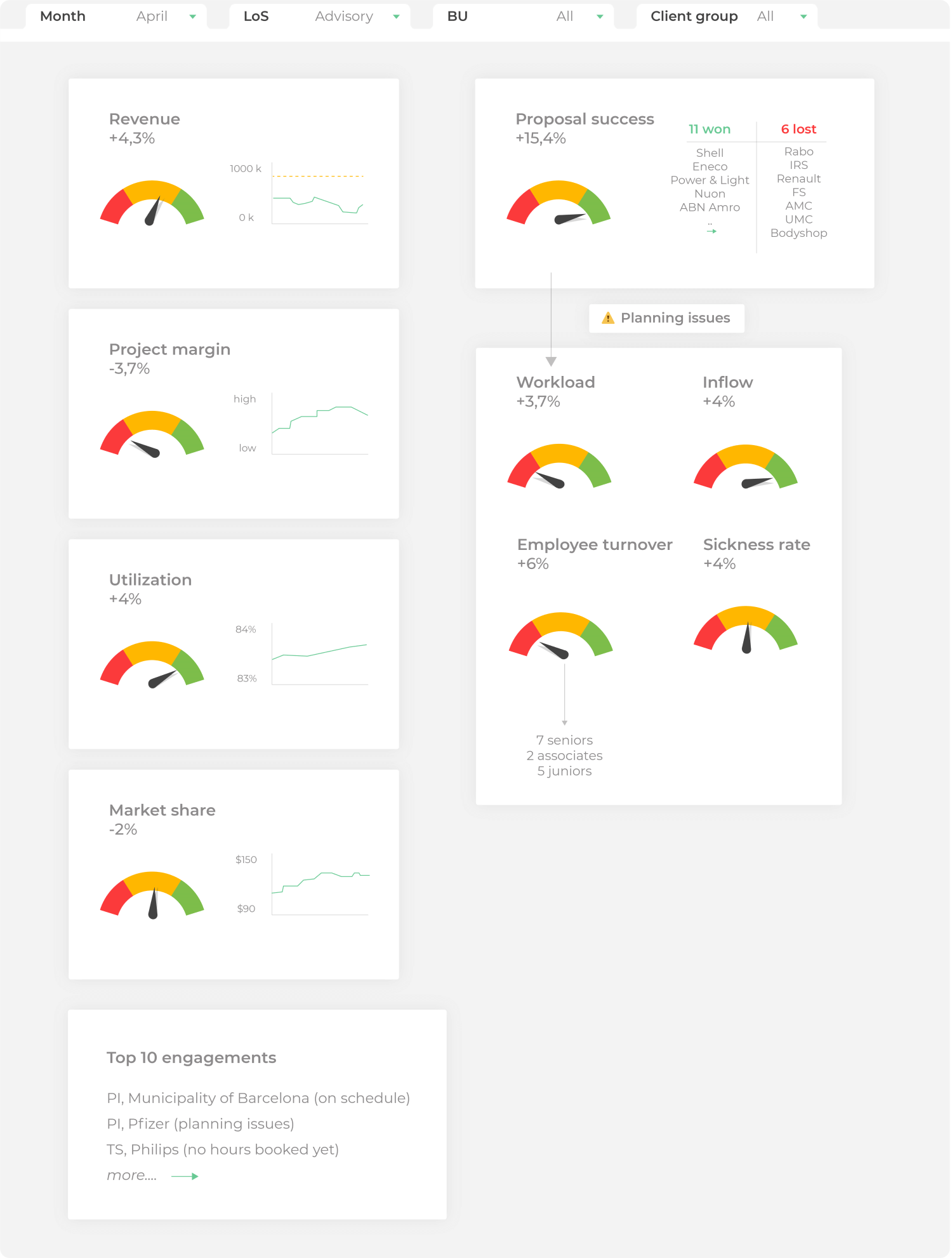 Figure 1: Example of a dashboard from business services.
In addition, various visualization types are used such as alerts, notifications, gauges, and compact trend graphs (spark lines).
2. KPI dashboard example: housing corporation
The KPI dashboard below shows the so-called performance drivers, the KPIs, of a housing corporation. By linking these KPIs to the Key Result Indicators (KRIs) and Performance Indicators (PIs), the manager and director gain insight into the causal connections and can steer and sharpen the strategy. Again, note the trend graphs and filter options on the right side of the KPI dashboard.
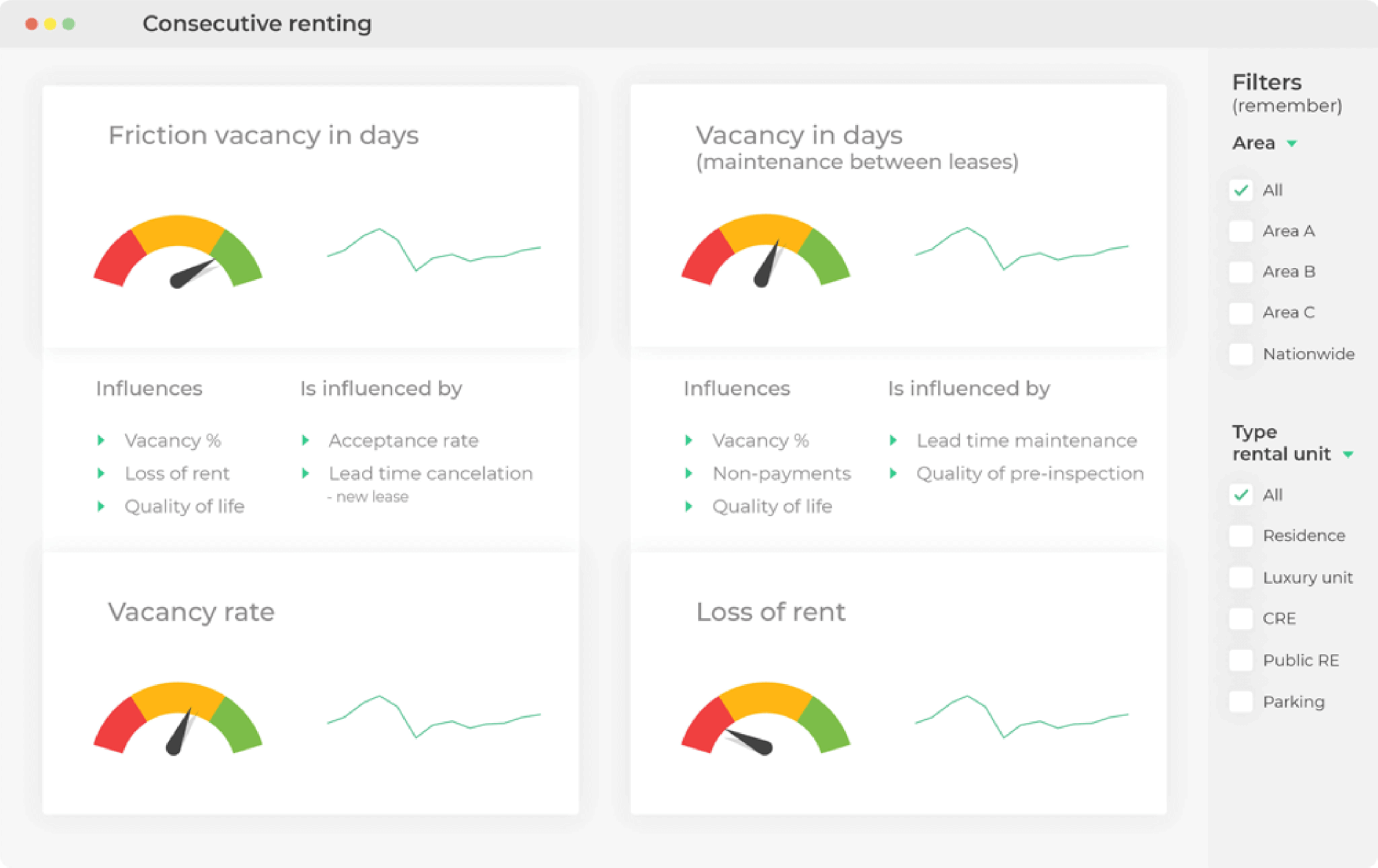 Figure 2: Example of a dashboard from the housing sector.
3. KPI dashboard example: food industry
On the KPI dashboard below from a factory, some operational KPIs have been visualized based on a number of predetermined dimensions and standards. The gauges show how efficiently this specific production line is running. Based on the underlying data, you can calculate the business price, efficiency, and utilization differences and make timely adjustments. To save space on the dashboard, the thousands are abbreviated to K.
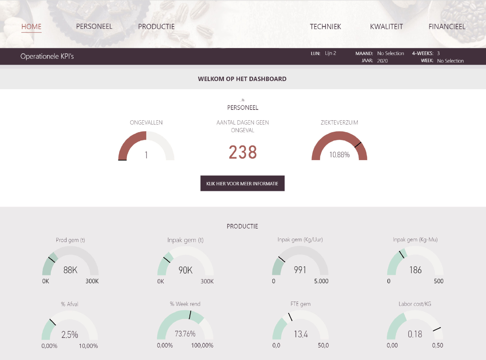 Figure 3: Example of a dashboard from the food industry.
4. Power BI dashboard example: municipality
This Power BI KPI dashboard below has been specially developed for a number of municipalities in the east of the Netherlands with a view to the budgetary consequences of the Social Support Act (WMO) introduced.
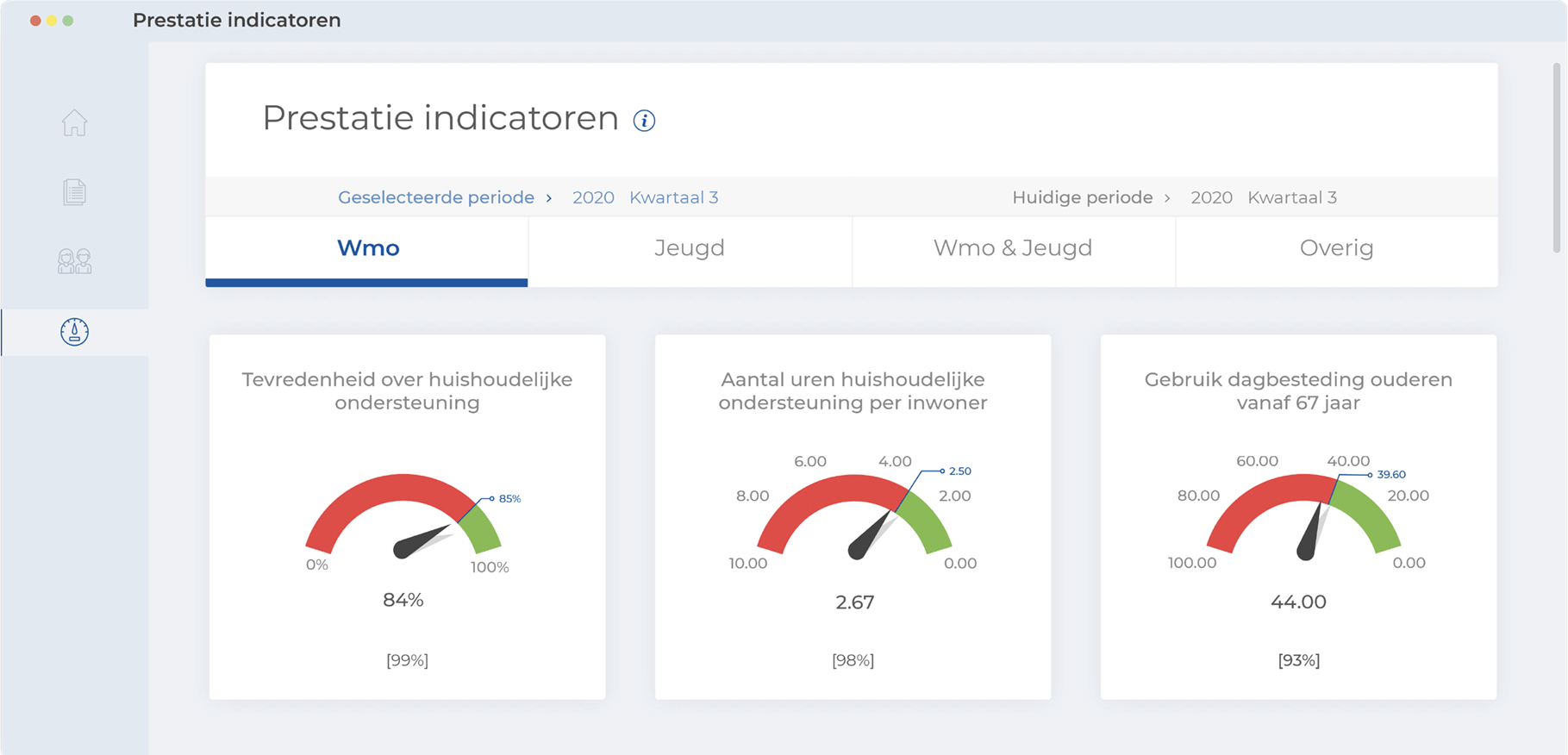 Figure 4: Example of a dashboard serving a Dutch municipality purchasing elderly care.
The monitoring of a number of performance indicators is done here initially on a quarterly basis. The tight budgetary space in which municipalities are expected to provide care for the elderly is striking.
5. Power BI KPI dashboard example: province
The interactive dashboard below, which was developed for one of the Dutch provinces, provides a complete overview of the province’s business park development (including the real estate database). Although the dashboard looks busy, it is still clear because all sections and themes are sharply delineated. The user has enough filter options to bring up the information relevant to them.
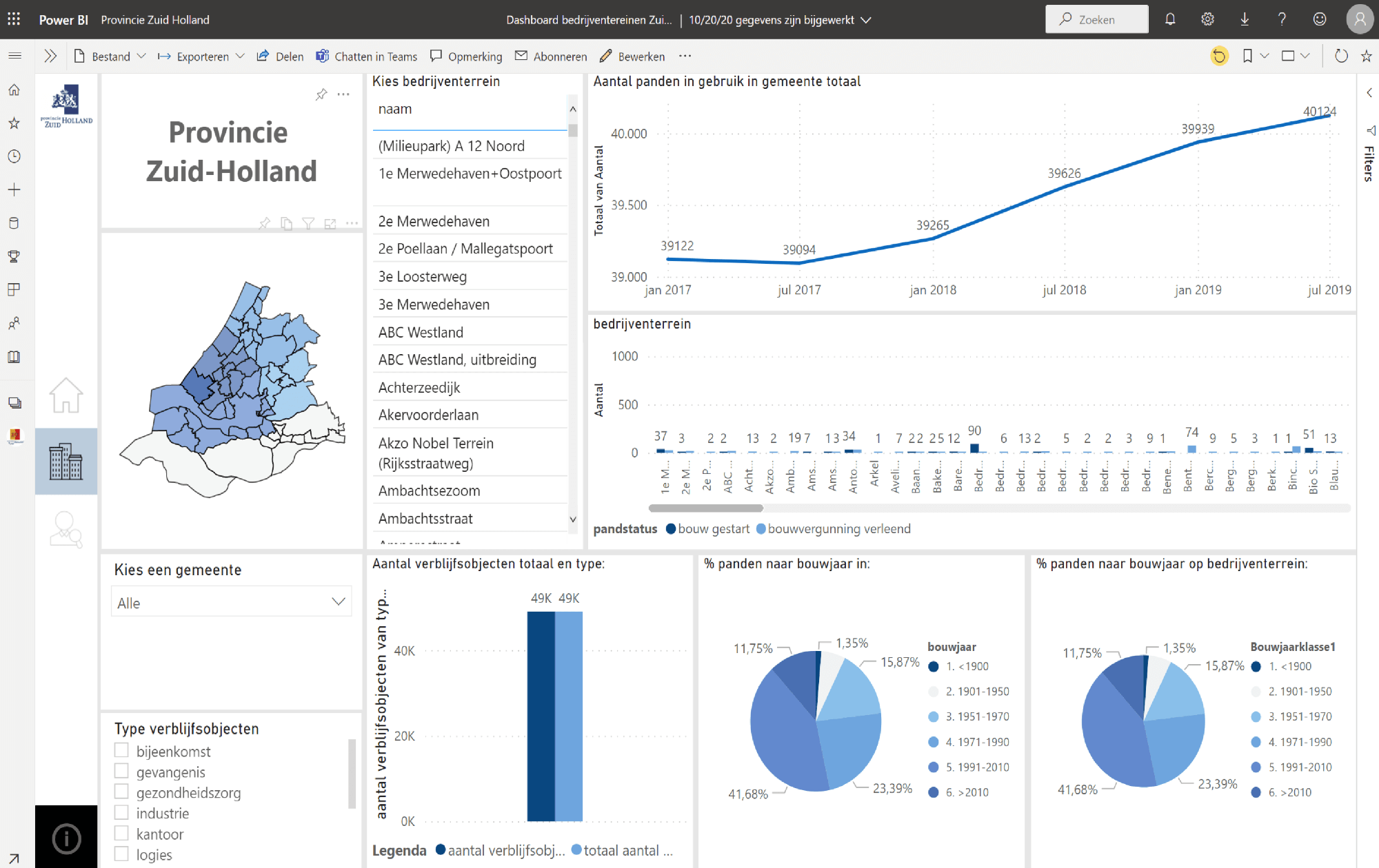 Figure 5: Example of a dashboard developed for a Dutch province.
6. Power BI dashboard example: youth care
The following dashboard has been developed for a municipality that wants to continue to monitor closely how the client base and the expenditure for personal budgets (the so-called PGBs) develop quarterly and annually. You can also read the payment flows per care provider on this dashboard.
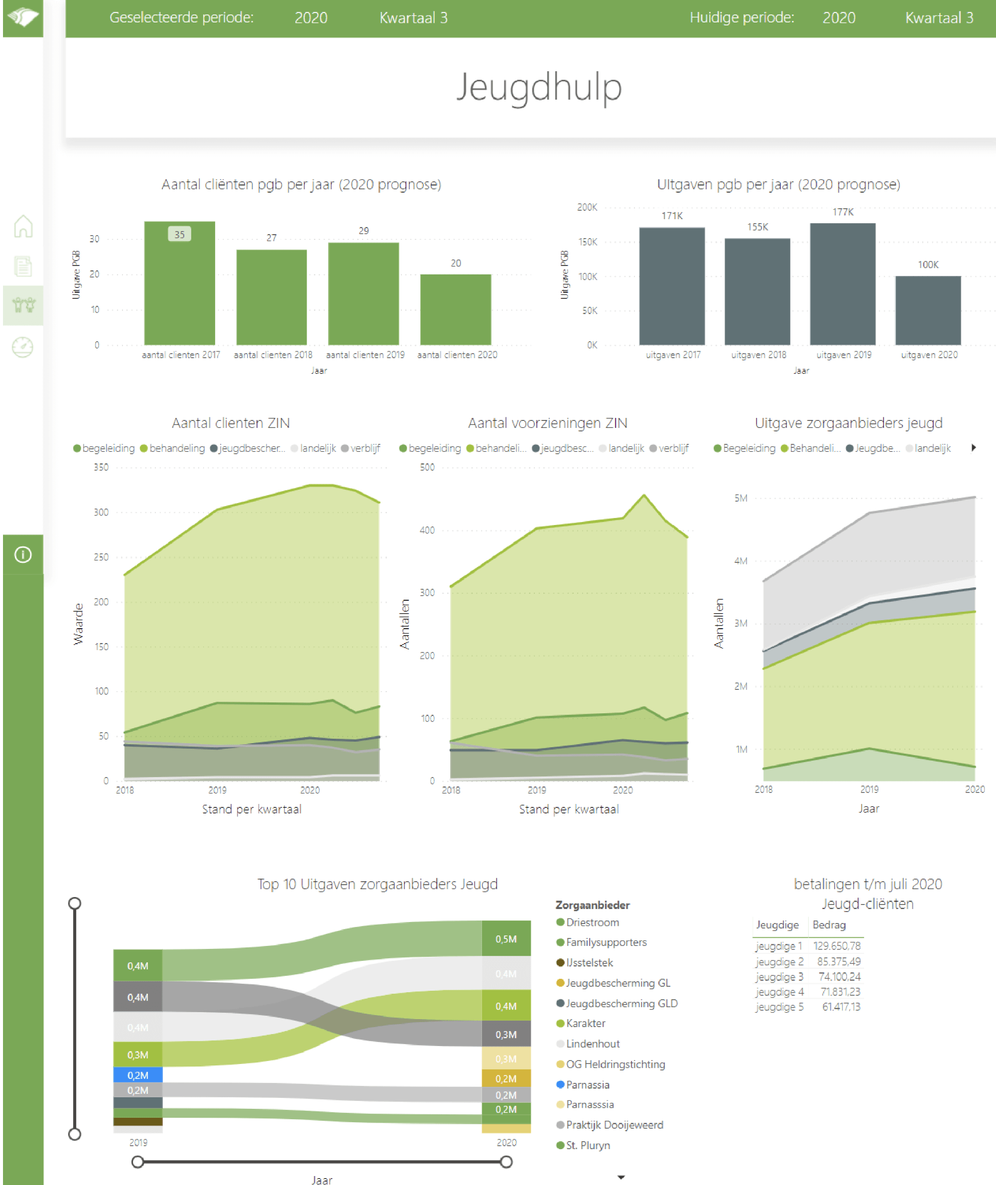 Figure 6: Example of a dashboard from a Dutch municipality that provides youth care services.
Are you looking for a similar or different KPI dashboard example, a management dashboard example, an HR dashboard example, or examples of Power BI dashboards? If you would like advice on strategy, smart goals examples, tips on setting up KPIs, and so on, please contact us.
How to create a dashboard?
 When it comes to creating a KPI dashboard, there are several possible ways. Based on years of practical experience, our dashboard consultants have developed a 7-step plan designed to simplify the process of dashboard development for consultants and BI managers.
Step 1. Determine the scope of your dashboard
Determine the level for which you want to create and deploy the dashboard. Is the dashboard intended for a specific team, a special department or do you want to develop an overarching dashboard for the entire organization? Will you possibly develop separate dashboards for the board of directors, the CEO, supervisors, and so on? Based on the requirements and wishes, draw up a global budget for your overall dashboard program, including an allowance for the necessary external support.
Step 2. Draw up a user analysis
Map out the specific information needs for the various user groups and roles (from CEO to call center employee). How can the dashboard that will be developed streamline the user’s workflow? Keep in mind that people with the same role in the organization do not always have the same user requirements. The personal KPIs on which the organization “rates” individual employees may also vary. Creating effective dashboards yourself at this stage is primarily about the people. How will they achieve their personal goals? What performance drivers play a role in this?
Step 3. Check the KPIs
Check to what extent the chosen KPIs correspond to the strategic, tactical, or operational objectives of the organization. If you start working with the wrong KPIs, or too many KPIs during this step, this can have major consequences for the final design and reliability of your dashboard. Some organizations have dozens of KPIs. Apart from the question of whether you can call these pure KPIs, you can of course never fit such numbers onto one screen. Keep the focus on the real KPIs. The dashboard data and BI dashboard tools to be used will be discussed later.
Step 4. Make a first rough draft of the dashboard
Whether it’s creating KPI dashboards, creating a BI dashboard, creating a management dashboard, or creating an online dashboard, you can always start with a rough, primitive sketch on paper. You don’t have to go digital right away. When setting strategic goals and their mutual relationships, you can additionally draw a business strategy map. There is a lot to be said for applying the proven concept of prototyping from the world of electronics and software to the process of creating dashboards. Therefore, create a prototype of the dashboard.
Step 5. Test the dashboard model with users
By sharing the preliminary layout of the dashboard model and prototype with future users, you elicit positive and negative feedback. For example, how does the prototype dashboard score on the usability aspect? With this, you can prevent a possible mismatch and misinterpretation of dashboard data. You also continue this after the implementation phase (see step 6). Based on feedback, you will further improve, refine, and perfect the dashboard. The first version of a dashboard is rarely perfect.
Step 6: Tool selection and implementation of the dashboard
Together with the external dashboard consultant, carry out a supplier and tool selection. Rationally select and implement the most appropriate dashboard tools. Don’t forget to communicate internally about your ongoing dashboard projects. Think about what core message, if any, you want to convey with your corporate dashboard. Will you choose a wall poster or digital screen in the factory hall? Are you considering narrowcasting via screens at the reception desk or in the call center to show production progress in real-time? It’s all possible.
Step 7. Improve the dashboard continuously
Improve your dashboard continuously on the basis of user feedback, progressive insights, newly discovered causal relationships, and patterns. Also, adjust the design of the dashboard, the so-called look & feel, regularly. To a certain extent, dashboards are also subject to fads. Something that looks slick today may already seem outdated two years later. In short: nobody feels comfortable with an old-fashioned-looking dashboard. In our experience, a modern dashboard increases the degree of acceptance.
A good dashboard developer takes matters into their own hands
Never ask users at too early a stage what kind of dashboard they want and what exactly it should look like visually. Such global open-ended questions during dashboard development rarely lead to an effective dashboard. Developing a dashboard based on the real needs of the users is a typical designer’s task. “People don’t know what they want until you show it to them,” is the principle Steve Jobs, former CEO of Apple, followed.
Build your own dashboard or have one built?
Building a dashboard yourself or having it developed is in fact a classic “make or buy” decision: do you want to do the dashboarding yourself or are you going to outsource the job, that is the dilemma.
Broadly speaking, when it comes to the option of building a dashboard yourself, you have three options. You can, for example, 1) create a dashboard based on a report, 2) create it completely from scratch, based on an existing dataset, or 3) copy and adapt an already existing dashboard. What you should never do, in any case, is build a dashboard tool yourself. You can easily save yourself those development costs. After all, in practice, there are already numerous excellent, crystallized dashboard tools, see also for example our BI & Analytics Guide 2026.
A dashboard to order?
In practice, you can probably find plenty of parties who promise you a dashboard “within a week”, a “customized online dashboard tool”, “free downloadable templates” or a “free trial”. Often all you have to do is supply your dashboard data and the dashboard will be delivered at the agreed time in your own house style and with your own specific requirements. Success assured, you would think. But the disappointment is usually great with such an impersonal relationship.
Without an analytical corporate culture and without knowing toward which desired behavior you should steer and what responses are possible, a beautifully designed dashboard will hardly yield any return.
For example, having a sales dashboard that is accepted by everyone is serious business. By just accepting an online offer from a relatively unknown party with a spectacular or unspectacular offer, you take an unnecessary risk. This also means that you do not cultivate involved and super-motivated salespeople. Dashboarding involves much more: an analytical company culture, data literacy assessment, improving data quality and consistently evaluating and adjusting standards and targets.
Get help with your dashboard projects
If, on the other hand, you hire an external party to enter into a discussion with the people on the work floor and, for example, organize an interactive session, the chances of success of your dashboard projects will probably be much higher. The internal involvement regarding your dashboard projects and your dashboard project management or dashboard program will increase anyway because the consultants of Passionned Group will simultaneously work on a good working atmosphere and healthy company culture. Do you also want this within your department or organization? Then talk to one of our dashboard specialists.
Make a prototype of the dashboard as a team
 Better said: building a dashboard based on the prototype is fun with an enthusiastic internal team. The advantage is also that within your organization you will build dashboarding expertise. An external party therefore offers absolute added value, provided that the organization can temporarily free up the right people for the dashboard program.
In addition, an external dashboard advisor can assess much more objectively whether the dashboard is sufficiently in line with the strategy, mission, and vision of the organization. Moreover, this way you can prevent tunnel vision in dashboarding. Passionned Group has experience with many different dashboard projects.
Follow a dashboard training
Making a Power BI and a Qlikview dashboard or developing a Tableau dashboard is no longer rocket science thanks to all kinds of self-service functionalities. In addition, nowadays there are plenty of training courses and consultants who will prepare you for this.
20 tips for a good dashboard
Do you want your organization to benefit from the advantages of a top dashboard? When creating a dashboard, you will have to take into account at least some general guidelines. Design a real, visually appealing dashboard (and not a mini report) using the following tips.

- Always design your dashboard with a well-defined goal and user group in mind.
- Align your core message with the information needs of your target audience and tell a consistent, visually appealing story.
- Show the key performance indicators (KPIs) and process indicators for each target group you want to monitor.
- Make the dashboard interactive to a limited extent by adding filtering and drill-down functionality. Show the most important mutations without requiring interaction.
- Design the dashboard so that users can look at the data in different ways from different angles.
- Use templates and standard design for uniform dashboarding. Monitor the corporate dashboard’s house style.
- Determine the content of your dashboard elements. What do you want to show: a comparison, a trend, a progress process, or a work stock?
- Based on the transaction volume, determine whether monthly, weekly, daily or real-time refreshment of the dashboard data is necessary.
- Keep it stupidly simple: keep the number of visual effects on your dashboard to an absolute minimum. Filter out all noise. Omit unnecessary lines.
- Apply Gestalt principles intelligently and place similar items logically together based on equality and proximity.
- Avoid overlapping frames and busy backgrounds on your dashboard.
- Make sure users can absorb and understand the dashboard data and visual message at a glance.
- Never use a black background for dashboarding but opt for white or light grids. Make smart use of “functional white”.
- Be consistent. Align similar dashboard elements, such as bar charts, and place them at the same height so everything looks clean.
- Accentuate the most important conclusion and most relevant items, but don’t overdo it.
- Ideally, have charts on your data dashboard start at zero. If possible, always show the context of the dashboard data as well.
- Do not use three-dimensional charts, backgrounds, or images. 3D diagrams are taboo.
- Shorten long numbers: 1,000,000 = 1M or mio, 1,000= 1K, 1,000,000,000 = 1 mrd.
- Use the “right” colors consistently and keep in mind common color blindness, especially in men.
- Jump soberly with typography: limit the number of italics, underlines, or bold fonts.
Do you want to get started with dashboarding and dashboard data right away, but do you need more context, follow the Power BI course data-driven work now. Do you need support in creating your own dashboard, or do you want us to develop one for you? Then contact one of our dashboard specialists now.
Best practices for dashboards
Based on the dashboard projects we have carried out for clients, we have collected a number of business intelligence dashboard best practices. With these you can test to what extent the existing dashboard projects within your organization meet a number of preconditions for data dashboarding.
- How to put the right KPIs on your dashboard (700+ examples, PDF)
- Create dashboards with Tableau software
- Software: Qlik dashboards
- What are Power BI dashboards?
- Solve the 7 biggest dashboard problems
Dashboard and reporting
The difference between a dashboard and a report is not clear to everyone. In practice, there is still a lot of confusion about the concept, and terms such as dashboard reporting, dashboard management information, dashboard data, and dashboard analysis are used interchangeably. Simply put, a report is usually more comprehensive and goes much deeper into the matter than a dashboard which, as mentioned, you should be able to consult without scrolling on a screen. A report is a comprehensive analysis or explanation of the organization’s results, where you can of course use a dashboard.
Dashboard monitoring versus dashboard performance
The terms dashboard monitoring and dashboard performance can also lead to confusion in this context. Monitoring is a term that comes from the process industry and literally means: “supervising or controlling a technical process”. In dashboard monitoring, as in a car, you periodically “check” the gauges on the dashboard. In business, you consult a KPI monitoring dashboard periodically, depending on the refresh rate. The same goes for the educational sector when it comes to an education reporting dashboard.
Dashboard performance, on the other hand, says nothing about the performance of the organization, but it does say something about the functioning of the management information dashboard itself, for example, the timeliness, availability, and connectivity of the dashboard.
The Data Science book for Decision Makers & Data Professionals How do you make the connection between dashboard data and the continuous improvement and innovation of business processes within your organization? This book (that has more than 25,000 copies sold) shows you how to apply that using data-driven improvement circles so that your organization reaches higher and higher levels.
Dashboard software
 Vendors of KPI dashboard software are often masters of marketing. They try to make their dashboard tools unique with all kinds of “nice to have” features. But that does not make you steer better with KPI dashboards. The bells and whistles distract from what really matters. So organizations looking for dashboarding software or a dashboarding tool should not be fooled by the marketing of the suppliers.
Dashboard tooling: open-source or licenses?
In addition to the commercial offerings, there are also a number of so-called freemium products, “free trials” and open-source dashboard management tools available that you may be able to download for free. Here too you have to be careful because this dashboard software often offers less functionality and is less well supported or sometimes not supported at all. After all, there is no such thing as a “free lunch”. Every dashboard overview that is made available to an end user comes with a price tag. In addition to the purchase cost, there are often necessary training and education costs. The cost of IT support from a help desk should also never be underestimated.
Prevent the proliferation of dashboard tools
Large organizations often find that just one dashboard tool is not enough and they obtain their dashboard tooling from multiple software suppliers. This threatens a potential proliferation when it comes to professional dashboard tooling, especially among multinationals.
Dashboard software: install on the desktop or in the cloud?
For the assessment of management dashboard software or a KPI dashboard tool, it can be important to know in advance on which operating systems (Mac, Windows, Linux, Android, iOS) the dashboard software will run.
A web-based, online dashboard tool may at first seem cheaper than a desktop-installed version, but this is not necessarily the case. The licensing structure of a provider of a dashboard management tool and dashboard data offered from the cloud is kept quite opaque in practice. This happens consciously and unconsciously. Large organizations in particular are confronted with this. Because of this, it almost always pays to make a serious comparison between for example a Qlikview dashboard, a Qlik Sense dashboard, a Power BI KPI dashboard, a Cognos dashboard, or Tableau dashboard. Not only in terms of functionality but also in terms of licenses and the price-quality ratio.
Some final remarks
There are also numerous software providers who offer a model dashboard or standard templates for dashboarding free of charge. With such a “dashboard in a business intelligence jacket”, you can indeed get started quickly, but you usually run into all kinds of limitations. The dashboarding functionality that makes the difference is usually hidden behind a “premium” payment button, or you only get it by ordering a subscription. In the end, cheap is often expensive and you would be better off doing business with a reputable dashboard company, a consultancy firm, or a management dashboard bureau.
Talk to a dashboard specialist now
Almost all consultants within Passionned Group have gained extensive experience with KPI dashboarding when carrying out projects for clients. They are all management dashboard specialists and dedicated when it comes to dashboard analysis, visualizing dashboard management information, creating dashboard KPIs, and implementing complete dashboard projects. Contact us now for an exploratory discussion about the added value of a dashboard program, KPI dashboard tools, and dashboard performance management for your organization.
About Passionned Group
![]() Passionned Group is a leading analyst and consultancy firm specialized in Business Analytics and Business Intelligence. Our passionate advisors assist many organizations in selecting the best Dashboarding Software and applications. Every two years we organize the election of the smartest company of the Netherlands: the Dutch BI & Data Science Award.
Passionned Group is a leading analyst and consultancy firm specialized in Business Analytics and Business Intelligence. Our passionate advisors assist many organizations in selecting the best Dashboarding Software and applications. Every two years we organize the election of the smartest company of the Netherlands: the Dutch BI & Data Science Award.
Frequently Asked Questions
What is the purpose of a dashboard?The purpose of a dashboard is to provide the decision-maker or user with the right insights at a glance to support informed decision-making.
What is a good dashboard?
A good dashboard instantly highlights the most important results and bottlenecks in your business processes, team, or organization. It also enables you to immediately analyze the underlying data.
How do I keep the dashboard clear?
Use tiles to separate specific information from more detailed data. A tile is a snapshot of your data, pinned to the dashboard.
How many KPIs should be on a dashboard?
Seven indicators, plus or minus two, is a golden rule of behavior according to research. Select only those KPIs that directly impact key result areas. Less is more!
Where do I place the most important information?
Always place the most important information at the top left of the dashboard. Most people naturally read from left to right and top to bottom.
How much does a customized dashboard cost?
That depends on the number of data sources, data quality, complexity of definitions, level of ambition, and more. On average, a first version of the dashboard costs €6,000.
How do you make a dashboard interactive and dynamic?
You make it interactive by adding filtering and click-through functionality.
Which dashboard tool is the best?
That depends on your requirements. Download the Business Intelligence & Analytics Guide™ 2026 to perform an initial objective assessment.
What is a Power BI dashboard?
A Microsoft Power BI dashboard consists of a single page—also called a canvas—where you tell a story using visualizations. It contains only the most important elements of that story.
Is dashboarding in Excel recommended?
No. If you’re serious about dashboarding, professional dashboarding software is always preferable. Excel has several drawbacks, such as difficulties collecting and importing data from multiple sources, as well as limitations in security and collaboration.
What is the relationship between digital signage and a KPI dashboard?
A KPI dashboard and digital signage complement each other perfectly. They allow you to visually convey relevant information to specific users or audiences at specific times.
What is the difference between a KPI dashboard and a Balanced Scorecard?
A KPI dashboard shows real-time performance on key metrics, while a Balanced Scorecard tracks strategic progress across multiple perspectives: financial, customer, internal processes, and learning & growth.